Selecting the right BI tool that the best fit for your organization is critical to address your big data problem. This process includes prioritizing and gathering BI requirements, as well as finding appropriate use cases and tool categories and styles.
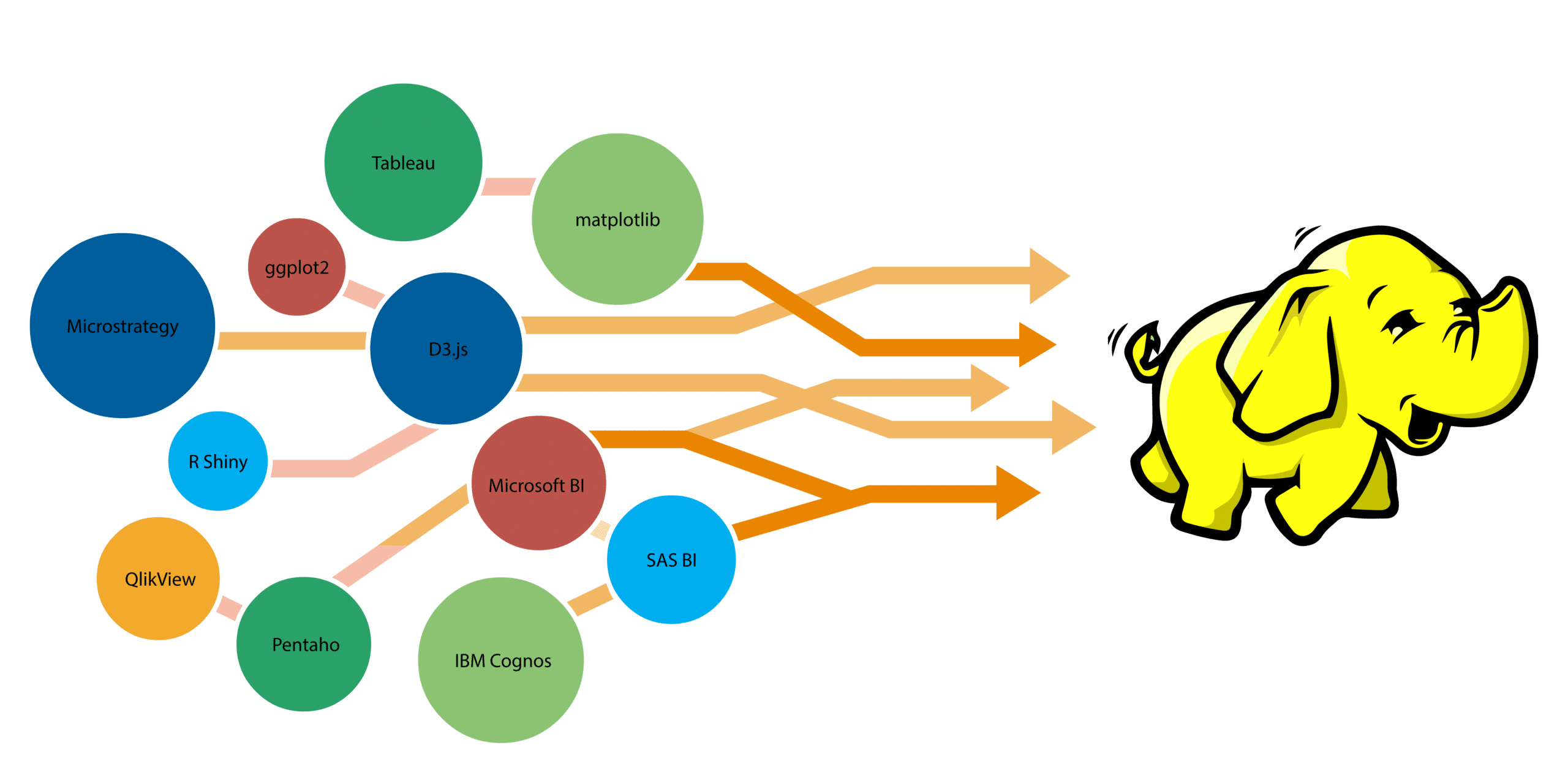
The big data and visualization market is presently filled with different kinds of visualization tools such as Tableau, Power BI, IBM Cognos (to name a few) having well-defined functions and user-friendly interface.
However, this is not the complete story as there are more advanced tools for professional developers and data scientists to derive customized insights out of these structured and unstructured data or information and to manage the data. In this blog, we will discuss some of the important features of big data visualization tools while making a choice among them:

Check the Data Source: Most of the organizations are looking out to visualize their internal data such as operations, marketing and finance and so on. In that case, it is advisable to use a visualization tool which is aligned with your data management system.
For instance, if you are using SAP ECC/Net Weaver system internally, then it would be better to choose an SAP BI platform in order to save your implementation cost and training effort.
On the other hand, if your aim is to collect and visualize external data, such as posts on Twitter and Facebook, then you are required to have BI tools which also have a big data streaming application feature to address 5Vs i.e. huge Volume, high Velocity, high Variety, low Veracity and high Value.
For example, the Zoomdata Server (which is largely based on Spark) can pull data from Hadoop, NoSQL stores, cloud apps, and traditional data warehouses, and makes it available in the visual data discovery and query interface. Moreover, access to various databases and file types such as comma-separated values file, text, Excel and XML are basic staples of all BI products.
Don’t make assumptions based on price alone: BI project costs can vary wildly depending on the level of in-house expertise and the company’s ultimate goals.
If you are among those companies which are upfront about total costs than others, you should take published pricing with a pinch of salt at the outset. If the project is big and complex and require some customization, then tools like Tableau (used by a number of startups), D3.js, ggplot2 (visualization package for R), matplotlib (standard python library), FusionCharts and Google Charts makes sense. Otherwise for small big data projects, charting libraries like Highcharts, R Shiny, and Chart.js among others could be a suitable option.
Before moving ahead with any visualization tool, it is recommended to give a shot for the free trial version of the software to see if it is in line with your project requirements and budget.
Know Your End-Users: If the main user of your new system is experienced data scientists or professional IT guys, then your choice could be wild including those Linux based or Java-based tools with high end visualization patterns.
On the other hand, if your end users are just general managers and other functional people, your choice will be narrowed, because you have to pick a schema freed tool from a limited number of choices. And since there would be a lot of users, you need to be very careful about administration and license management.
In-house Expertise: If you have a good level of expertise around coding, tools like D3.js, FusionCharts, chart.js, RShiny, dygraphs are some of the best options. Moreover, Standard BI tools such as Microstrategy, Pentaho on the other hand allow writing SQL on top of Hadoop data. For non-programmers, tools like Tableau, Infogram, Datwrapper, Timeline JS, Fusioo, Gephi and Plotly, among others are good alternatives.
In one of our Adtech projects, which was focused on streamlining the data gathering, refining, harmonizing and visualization process end-to-end. We have extensively made use of QlikView to effectively mine key information from the mountains of data residing in existing technology systems.
Functions: It depends on different companies and industries. For example, Wal-Mart has thousands of retailing stores all over the world, then it is necessary for them to have a visualization tool that enables GIS features, also if the under/over stock cost is high, they may also need a real-time computing engine.
Hadoop Distribution Used: Tools like Tableau, Microstrategy, QlikView and Pentaho etc. are all certified by Cloudera and have proven connectors to Cloudera distribution of Hadoop.
In case, your Big Data platform is IBM BigInsights, then going for Cognos makes sense since being IBM products, compatibility will not be an issue. It is always advisable to check if the tool you are selecting for visualization is certified by the Hadoop distribution being used.
Compatibility with Operating System: Some of the top BI tools like Tableau, QlikView, and Microsoft BI are windows based tools and thus are not compatible with Linux platforms.
Therefore, it is important to do a quick compatibility check of a visualization tool you are going to use with your operating system. Also, if you are planning an implementation on cloud, make sure your cloud migration services provider can provide OS required by the visualization tool.
Enhance your existing BI tool: It is always better to enhance your current system or resources than simply implementing a new one. You may have SAS, Microstrategy, IBM Cognos, and OBIEE in your company.
Most of these tools have made a tremendous investment in enhancing their compatibility with Hadoop ecosystem. They have connectors for Hadoop and NoSQL databases. Think of using your existing BI tool for Hadoop data visualization unless there are obvious drawbacks in it.
Cloud BI vs On-premise BI model: Based on your business requirement, you can choose the deployment model for your BI application. The table below illustrates the key differences between Cloud BI and On-premise BI :
| Cloud BI | Vs | On-premise BI |
| Short | Implementation Time | Significantly Longer |
| Low | Upfront Investment | High |
| No | Additional Hardware/IT Costs | Yes |
| Predictable | All-time Costs | Unpredictable (but maybe lower) |
| Low | Degree of Customization | High |
| Vendor | Control of Data | User or Organization |
Summary:
In the world of big data, where every information is crucial in one way or the other we rely on the visual information and real-time data to find useful patterns. We reviewed some of the important criteria and features while choosing a BI tool for your big data problem. Every visualization tool has its own merits and demerits and hence must be chosen based on your requirements, budget and in-house expertise.
